2. Manipulating and plotting data in Python: numpy, and matplotlib libraries
Table of Contents
While Python has a rich set of modules and data types by default, for
numerical computing you’ll be using two main libraries that conform the
backbone of the Python scientific
stack. These libraries implement a
great deal of functionality related to mathematical operations and
efficient computations on large data volumes. These libraries are
`numpy <http://numpy.org>`__ and `scipy <http://scipy.org>`__.
numpy, which we will concentrate on in this section, deals with
efficient arrays, similar to lists, that simplify many common processing
operations. Of course, just doing calculations isn’t much fun if you
can’t plot some results. To do this, we use the
`matplotlib <http://matplotlib.org>`__ library.
But first, we’ll see the concept of functions….
2.1 Functions
A function is a collection of Python statements that do something (usually on some data). For example, you may want to convert from Fahrenheit to Centigrade. The conversion is
A Python function will have a name (and we hope that the name is self-explanatory as to what the function does), and a set of input parameters. In the case above, the function would look like this:
def fahrenheit_to_centigrade(deg_fahrenheit):
    """A function to convert from degrees Fahrenheit to degrees Centigrade

    Parameters
    ----------
    deg_fahrenheit: float
        Temperature in degrees F

    Returns
    -------
    Temperature converted to degrees C
    """
    deg_c = (deg_fahrenheit - 32.)*5./9.
    return deg_c
We see that the function has a name (fahrenheit_to_centigrade), and
takes one parameter (deg_fahrenheit).
The main body of the function is indented (like if and for
statements). There is first a comment string, that describes what the
function does, as well as what the inputs are, and what the output is.
This is just useful documentation of the code.
The main body of the function calculates deg_C from the given input,
and returns it back to the user.
Notice that the document string
"""A function to convert from temperature... """ is what is printed
when you request help on the function:
help(fahrenheit_to_centigrade)
Help on function fahrenheit_to_centigrade in module __main__:

fahrenheit_to_centigrade(deg_fahrenheit)
    A function to convert from degrees Fahrenheit to degrees Centigrade

    Parameters
    ----------
    deg_fahrenheit: float
        Temperature in degrees F

    Returns
    -------
    Temperature converted to degrees C
E2.1.1 Exercise
- In the vein of converting units, write functions that convert from
- inches to m (and back)
- kg to stones (and back)
Hint: A stone is equal to 14 pounds, and a pound is equal to 0.45359237 kg.
Ensure that your functions are clearly named, have sensible variable names, a brief docmentation string, and remember to test the functions work: just demonstrate running the function with some input pairs where you know the output and checking it makese sense.
# Space for your solution
2.2 numpy
2.2.1 arrays
You import the numpy library using
import numpy as np
This means that all the functionality of numpy is accessed by the
prefix np.: e.g. np.array. The main element of numpy is
the numpy array. An array is like a list, but unlike a list, all the
elements are of the same type, floating point numbers for example.
Let’s see some arrays in action…
import numpy as np  # Import the numpy library

# An array with 5 ones
arr = np.ones(5)
print(arr)
print(type(arr))

# An array started from a list of **integers**
arr = np.array([1, 2, 3, 4])
print(arr)

# An array started from a list of numbers, what's the difference??
arr = np.array([1., 2, 3, 4])
print(arr)
[1. 1. 1. 1. 1.]
<class 'numpy.ndarray'>
[1 2 3 4]
[1. 2. 3. 4.]
In the example above we have generated an array where all the elements
are 1.0, using
`np.ones <https://docs.scipy.org/doc/numpy/reference/generated/numpy.ones.html>`__,
and then we have been able to generate arrays from lists using the
`np.array <https://docs.scipy.org/doc/numpy/reference/generated/numpy.array.html>`__
function. The difference between the 2nd and 3rd examples is that in the
2nd example, all the elements of the list are integers, and in the 3rd
example, one is a floating point number. numpy automatically makes
the array floating point by converting the integers to floating point
numbers.
What can we do with arrays? We can efficiently operate on individual elements without loops:
arr = np.ones(10)
print(2 * arr)
[2. 2. 2. 2. 2. 2. 2. 2. 2. 2.]
numpy is clever enough to figure out that the 2 multiplying the
array is applied to all elements of the array, and returns an array of
the same size as arr with the elements of arr multiplied by 2.
We can also multiply two arrays of the same size. So let’s create an
array with the numbers 0 to 9 and one with the numbers 9 to 0 and do a
times table:
arr1 = 9 * np.ones(10)
arr2 = np.arange(1, 11)  # arange gives an array from 1 to 11, 11 not included

print(arr1)
print(arr2)

print(arr1 * arr2)
[9. 9. 9. 9. 9. 9. 9. 9. 9. 9.]
[ 1  2  3  4  5  6  7  8  9 10]
[ 9. 18. 27. 36. 45. 54. 63. 72. 81. 90.]
E2.2.1 Exercise
Using code similar to the above and a
forloop, write the times tables for 2 to 10. The solution you’re looking for should look a bit like this:[ 2 4 6 8 10 12 14 16 18 20] [ 3 6 9 12 15 18 21 24 27 30] [ 4 8 12 16 20 24 28 32 36 40] [ 5 10 15 20 25 30 35 40 45 50] [ 6 12 18 24 30 36 42 48 54 60] [ 7 14 21 28 35 42 49 56 63 70] [ 8 16 24 32 40 48 56 64 72 80] [ 9 18 27 36 45 54 63 72 81 90] [ 10 20 30 40 50 60 70 80 90 100]
# Your solution here
If the arrays are of the same shape, you can do standard operations between them element-wise:
arr1 = np.array([3, 4, 5, 6.])
arr2 = np.array([30, 40, 50, 60.])

print(arr2 - arr1)
print(arr1 * arr2)

print("Array shapes:")
print("arr1: ", arr1.shape)
print("arr2: ", arr2.shape)
[27. 36. 45. 54.]
[ 90. 160. 250. 360.]
Array shapes:
arr1:  (4,)
arr2:  (4,)
The numpy documenation is huge. There’s an user’s
guide, as well as
a reference to all the contents of the
library.
There’s even a tutorial
availabe if
you get bored with this one.
2.2.2 More detail about numpy.arrays
So far, we have seen a 1D array, which is the equivalent to a vector. But arrays can have more dimensions: a 2D array would be equivalent to a matrix (or an image, with rows and columns), and a 3D array would be a volume split into voxels, as seen below
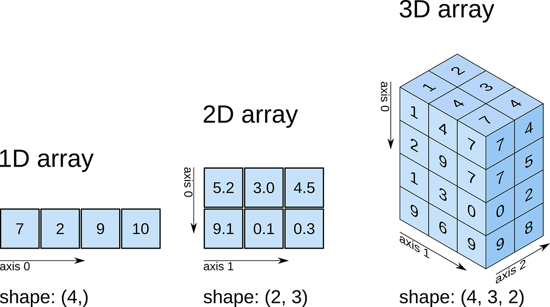
numpy arrays
So a 1D array has one axis, a 2D array has 2 axes, a 3D array 3, and so
on. The shape of the array provides a tuple with the number of
elements along each axis. Let’s see this with some generally useful
array creation options:
# Create a 2D array from a list of rows. Note that the 3 rows have the same number of elements!
arr1 = np.array([[0, 1, 2, 3, 4], [5, 6, 7, 8, 9], [10, 11, 12, 13, 14]])
# A 2D array from a list of tuples.
# We're specifically asking for floating point numbers
arr2 = np.array([(1.5, 2, 3), (4, 5, 6)], dtype=np.float)
print("3*5 array:")
print(arr1)
print("2*3 array:")
print(arr2)
3*5 array:
[[ 0  1  2  3  4]
 [ 5  6  7  8  9]
 [10 11 12 13 14]]
2*3 array:
[[1.5 2.  3. ]
 [4.  5.  6. ]]
2.2.3 Array creators
Quite often, we will want to initialise an array to be all the same
number. The methods for doing this as 0,1 and unspecified in numpy
are np.zeros(), np.ones(), np.empty() respectively.
# Creates a 3*4 array of 0s
arr = np.zeros((3, 4))
print("3*4 array of 0s")
print(arr)

# Creates a 2x3x4 array of int 1's
print("2*3*4 array of 1s (integers)")
arr = np.ones((2, 3, 4), dtype=np.int)
print(arr)

# Creates an empty (e.g. uninitialised) 2x3 array. Elements are random
print("2*3 empty array (contents could be anything)")
arr = np.empty((2, 3))
print(arr)
3*4 array of 0s
[[0. 0. 0. 0.]
 [0. 0. 0. 0.]
 [0. 0. 0. 0.]]
2*3*4 array of 1s (integers)
[[[1 1 1 1]
  [1 1 1 1]
  [1 1 1 1]]

 [[1 1 1 1]
  [1 1 1 1]
  [1 1 1 1]]]
2*3 empty array (contents could be anything)
[[1.5 2.  3. ]
 [4.  5.  6. ]]
Exercise E2.2.2
- write a function that does the following:
- create a 2-D tuple called
indicescontaining the integers((0, 1, 2, 3, 4),(5, 6, 7, 8, 9)) - create a 2-D numpy array called
dataof shape(5,10), data typeint, initialised with zero - set the value of
data[r,c]to be1for each of the 5 row,column pairs specified inindices. - return the data array
- create a 2-D tuple called
- print out the result returned
The result should look like:
[[0 0 0 0 0 1 0 0 0 0]
 [0 0 0 0 0 0 1 0 0 0]
 [0 0 0 0 0 0 0 1 0 0]
 [0 0 0 0 0 0 0 0 1 0]
 [0 0 0 0 0 0 0 0 0 1]]
Hint: You could use a for loop, but what does data[indices]
give?
# do exercise here
Exercise 2.2.3
- write a more flexible version of you function above where
indices, the value you want to set (1above) and the desired shape ofdataare specified through function keyword arguments (e.g.indices=((0, 1, 2, 3, 4),(5, 6, 7, 8, 9)),value=1,shape=(5,10))
# do exercise here
As well as initialising arrays with the same number as above, we often
also want to initialise with common data patterns. This includes simple
integer ranges (start, stop, skip) in a similar fashion to slicing
in the last session, or variations on this theme:
### array creators

print("1D array of numbers from 0 to 2 in increments of 0.3")
start = 0
stop  = 2.0
skip  = 0.3

arr = np.arange(start,stop,skip)
print(f'arr of shape {arr.shape}:\n\t{arr}')

start = 0
stop  = 34
nsamp = 9
arr = np.linspace(start,stop,nsamp)
print(f"array of shape {arr.shape} numbers equally spaced from {start} to {stop}:\n\t{arr}")

np.linspace(stop,start,9)
1D array of numbers from 0 to 2 in increments of 0.3
arr of shape (7,):
    [0.  0.3 0.6 0.9 1.2 1.5 1.8]
array of shape (9,) numbers equally spaced from 0 to 34:
    [ 0.    4.25  8.5  12.75 17.   21.25 25.5  29.75 34.  ]
array([34. , 29.75, 25.5 , 21.25, 17. , 12.75, 8.5 , 4.25, 0. ])
Exercise E2.2.4
- print an array of integer numbers from 100 to 1
- print an array with 9 numbers equally spaced between 100 and 1
Hint: what value of skip would be appropriate here? what about start
and stop?
# do exercise here
2.2.4 Summary statistics
Below are some typical arithmetic operations that you can use on arrays. Remember that they happen elementwise (i.e. to the whole array).
b = np.arange(4)
print(f'{b}^2 = {b**2}\n')

a = np.array([20, 30, 40, 50])
print(f"assuming in radians,\n10*sin({a}) = {10 * np.sin(a)}")

print("\nSome useful numpy array methods for summary statistics...\n")
print("Find the maximum of an array: a.max(): ", a.max())
print("Find the minimum of an array: a.min(): ", a.min())
print("Find the sum of an array: a.sum(): ", a.sum())
print("Find the mean of an array: a.mean(): ", a.mean())
print("Find the standard deviation of an array: a.std(): ", a.std())
[0 1 2 3]^2 = [0 1 4 9]

assuming in radians,
10*sin([20 30 40 50]) = [ 9.12945251 -9.88031624  7.4511316  -2.62374854]

Some useful numpy array methods for summary statistics...

Find the maximum of an array: a.max():  50
Find the minimum of an array: a.min():  20
Find the sum of an array: a.sum():  140
Find the mean of an array: a.mean():  35.0
Find the standard deviation of an array: a.std():  11.180339887498949
Let’s access an interesting dataset on the frequency of satellite launches to illustrate this.

SpaceX landing
from geog0111.nsat import nsat

'''
This dataset gives the number of
satellites launched per month and year
data from https://www.n2yo.com
'''
# We use the code supplied in nsat.py
# to generate the dataset (takes time)
# or to load it if it exists
data,years = nsat().data,nsat().years

print(f'data shape {data.shape}')

print(f'some summary statistics over the period {years[0]} to {years[1]}:')
print(f'The total number of launches is {data.sum():d}')
print(f'The mean number of launches is {data.mean():.3f} per month')
data shape (12, 62)
some summary statistics over the period 1957 to 2019:
The total number of launches is 43611
The mean number of launches is 58.617 per month
Exercise E2.2.5
- copy the code above but generate a fuller set of summary statistics including the standard deviation, minimum and maximum.
# do exercise here
Whilst we have generated some interesting summary statistics on the dataset, it’s not really enough to give us a good idea of the data characteristics.
To do that, we want to be able to ask somewhat more complex questions of the data, such as, which year has the most/least launches? which month do most launches happen in? which month in which year had the most launches? which years had more than 100 launches?
To be able to address these, we need some new concepts:
- methods
argmin()andargmax()that provide the index where the min/max occurs - filtering and the related method
where() axismethods: the dataset is two-dimensional, and for some questions we need to operate only over one of these
To illustrate:
from geog0111.nsat import nsat
import numpy as np

data,years = nsat().data,nsat().years

year = np.arange(years[0],years[1],dtype=np.int)

# sum the data over all months (axis 0)
sum_per_year = data.sum(axis=0)

imax = np.argmax(sum_per_year)
imin = np.argmin(sum_per_year)

# filtering
# high(low) is an array set to True where the condition
# is True, and False otherwise
high = sum_per_year>=1000
low  = sum_per_year<=300

print(f'the year with most launches was {year[imax]} with {sum_per_year[imax]}')
print(f'the year with fewest launches was {year[imin]} with {sum_per_year[imin]}')

print('\nThe years with >= 1000 launches are:')
print(year[high],'\nvalues:\n',sum_per_year[high])
print('The years with <= 300 launches are:')
print(year[low],'\nvalues:\n',sum_per_year[low])
the year with most launches was 1999 with 4195
the year with fewest launches was 1957 with 3

The years with >= 1000 launches are:
[1965 1975 1976 1981 1986 1987 1993 1994 1999 2006]
values:
 [1527 1195 1264 1190 1375 1130 2131 1166 4195 1158]
The years with <= 300 launches are:
[1957 1958 1959 1960 1962 1996 2002 2003 2004 2005]
values:
 [  3  11  22  52 207 246 277 243 209 192]
Exercise E2.2.6
- copy the code above, and modify it to find the total launches per month (over all years)
- show these data in a table
- which month do launches mostly take place in? which month do launches most seldom take place in?
# do exercise here
The form of filtering above (high = sum_per_year>=1000) produces a
numpy array of the same shape as that operated on (sum_per_year
here) of bool data type. It has entries of True where the
condition is met, and False where it is not met.
from geog0111.nsat import nsat
# sum the data over all months (axis 0)
sum_per_year = nsat().data.sum(axis=0)

high = sum_per_year>=1000
low  = sum_per_year<=300

print(f'type(sum_per_year): {type(sum_per_year)}, sum_per_year.shape: {sum_per_year.shape}, ' \
        + f'sum_per_year.dtype: {sum_per_year.dtype}')
print(f'type(high): {type(high)}, high.shape: {high.shape}, high.dtype: {high.dtype}\n')

print(f'sum_per_year: {sum_per_year}')
print(f'high: {high}')
print(f'low: {low}')
type(sum_per_year): <class 'numpy.ndarray'>, sum_per_year.shape: (62,), sum_per_year.dtype: int64
type(high): <class 'numpy.ndarray'>, high.shape: (62,), high.dtype: bool

sum_per_year: [   3   11   22   52  396  207  346  401 1527  786  466  690  641  906
  636  654  875  694 1195 1264  891  783  857  637 1190  946  884  760
  788 1375 1130  814  950  691  691  740 2131 1166  534  246  960  651
 4195  730  582  277  243  209  192 1158  349  406  378  373  315  435
  352  355  335  308  512  320]
high: [False False False False False False False False  True False False False
 False False False False False False  True  True False False False False
  True False False False False  True  True False False False False False
  True  True False False False False  True False False False False False
 False  True False False False False False False False False False False
 False False]
low: [ True  True  True  True False  True False False False False False False
 False False False False False False False False False False False False
 False False False False False False False False False False False False
 False False False  True False False False False False  True  True  True
  True False False False False False False False False False False False
 False False]
We can think of this logical array as a ‘data mask’ that we use to select (filter) entries.
The figure shows log(sum_per_year) in the top line of the image
(numbers represented by colour shown in colourbar), then a
representation of the bool arrays high and low. Where the
bool value is shown yellow, the ‘data mask’ is true. 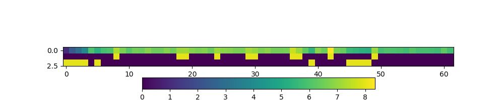
print(f'{sum_per_year[high]}')
print(f'{sum_per_year[low]}')
[1527 1195 1264 1190 1375 1130 2131 1166 4195 1158]
[  3  11  22  52 207 246 277 243 209 192]
Sometimes, instead of just applying the filter as above, we want to know the indices of the filtered values.
To do this, we can use the np.where() method. This takes a bool
array as its argument (such as our data masks or other conditions) and
returns a tuple of the indices where this is set True.
from geog0111.nsat import nsat
data,years = nsat().data,nsat().years
# where :
# which months in the dataset were particularly busy ..
# we select data > 400 as a condition

indices = np.where(data > 400)
print(f'indices:\n{indices[0]}\n{indices[1]}')
print(f'\ntype(indices): {type(indices)}')
print(f'len(indices): {len(indices)}, len(indices[0]): {len(indices[0])}')
print(f'type(indices[0][0]): {type(indices[0][0])}')

year = np.arange(years[0],years[1],dtype=np.int)
month = np.arange(12)

nsamp = len(indices[0])

# loop over the entries in the tuple
print('*'*23)
print('busy months')
print('*'*23)
for i in range(nsamp):
    print(f'{i:04d} month {month[indices[0][i]]:02d}'+\
                  f' year {year[indices[1][i]]:04d}')
print('*'*23)
indices:
[1 3 4 4 5 5 5 6 8 8 9 9]
[29 13 37 42 24 36 49 19 40 43  8 42]

type(indices): <class 'tuple'>
len(indices): 2, len(indices[0]): 12
type(indices[0][0]): <class 'numpy.int64'>
*******************
busy months
*******************
0000 month 01 year 1986
0001 month 03 year 1970
0002 month 04 year 1994
0003 month 04 year 1999
0004 month 05 year 1981
0005 month 05 year 1993
0006 month 05 year 2006
0007 month 06 year 1976
0008 month 08 year 1997
0009 month 08 year 2000
0010 month 09 year 1965
0011 month 09 year 1999
*******************
Exercise E2.2.7
- Using code from the sections above, print out a table with the busiest launch months with an additional column stating the number of launches
Hint: this is just adding another column to the print statement in the for loop
# do exercise here
You might notice the indices in the tuple derived above using where
are ordered, but the effect of this is that the months are in
sequential order, rather than the years. We have
month[indices[0][i]]
year[indices[1][i]]
If we want to put the data in year order, there are several ways we
could go about this. An insteresting one, following the ideas in
argmax() and argmin() above is to use argsort(). This gives
the indices of the sorted array, rather than the values.
So here, we can find the indices of the year-sorted array, and apply
them to both month and year datasets:
# prepare data as above
from geog0111.nsat import nsat
data,years = nsat().data,nsat().years
indices = np.where(data > 400)
year = np.arange(years[0],years[1],dtype=np.int)
month = np.arange(12,dtype=np.int)

# store the months and years
# in their unsorted (original) form
unsorted_months = month[indices[0]]
unsorted_years = year[indices[1]]
print(f'years not in order: {unsorted_years}')
print(f'but months are:     {unsorted_months}\n')


# get the indices to put years in order
year_order = np.argsort(indices[1])

# apply this to months and years
print(f'year order: {year_order}\n')
print(f'years in order: {unsorted_years[year_order]}')
print(f'months in year order: {unsorted_months[year_order]}')
years not in order: [1986 1970 1994 1999 1981 1993 2006 1976 1997 2000 1965 1999]
but months are:     [1 3 4 4 5 5 5 6 8 8 9 9]

year order: [10  1  7  4  0  5  2  8  3 11  9  6]

years in order: [1965 1970 1976 1981 1986 1993 1994 1997 1999 1999 2000 2006]
months in year order: [9 3 6 5 1 5 4 8 4 9 8 5]
Exercise E2.2.8
- Use this example of
argsort()to redo Exercise E2.2.7, putting the data in correct year order
# do exercise here
2.2.5 Summary
In this section, you have been introduced to more detail on arrays in
numpy. The big advantages of numpy are that you can easily
perform array operators (such as adding two arrays together), and that
numpy has a large number of useful functions for manipulating
N-dimensional data in array form. This makes it particularly appropriate
for raster geospatial data processing.
We have seen how to create various forms of array (e.g. np.ones(),
np.arange()), how to calculate some basic statistics (min(),
max() etc), and finding the array index where some pattern occurs
(e.g. argmin(), argsort() or where()).
2.3 Plotting with Matplotlib
There are quite a few graphical libraries for Python, but matplotlib is probably the most famous one. It does pretty much all you need in terms of 2D plots, and simple 3D plots, and is fairly straightforward to use. Have a look at the matplotlib gallery for a fairly comprehensive list of examples of what the library can do as well as the code that was used in the examples.
Importing matplotlib
You can import matplotlib with
import matplotlib.pyplot as plt
As with numpy, it’s custom to use the plt prefix to call
matplotlib commands. In the notebook, you should also issue the
following command just after the import
%matplotlib notebook
or
%matplotlib inline
The former command will make the plots in the notebook interactive (i.e. point-and-click-ey), and the second will just stick the plots into the notebook as PNG files.
Simple 2D plots
The most basic plots are 2D plots (e.g. x and y).
import matplotlib.pyplot as plt
%matplotlib inline

from geog0111.nsat import nsat
import numpy as np
'''
This dataset gives the number of
satellites launched per month and year

data from https://www.n2yo.com
'''
data,years = nsat().data,nsat().years
year = np.arange(years[0],years[1],dtype=np.int)
# sum the data over all months (axis 0)
sum_per_year = data.sum(axis=0)

print(f'data shape {data.shape}')

# plot x as year
# plot y as the number of satellites per year
plt.plot(year,sum_per_year,label='launches per year')
data shape (12, 62)
[<matplotlib.lines.Line2D at 0x1168270b8>]
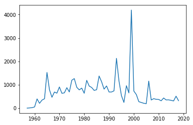
Whilst this plot is fine, there are a few simple things we could do improve it.
We will go through some of the options below, but to get a taste of improved ploitting, lets use e.g.:
- reset the image shape/size
plt.figure(figsize=(13,3))
- plot the mean value (as a red dashed line) for comparison
plt.plot([year[0],year[-1]],[mean,mean],'r--',label='mean')
- limit the dataset to range of variable
yearplt.xlim(year[0],year[-1])
- put labels on the x and y axes
plt.xlabel('year')plt.ylabel('# satellite launches')
- set a title
plt.title('data from https://www.n2yo.com')
- use a legend (in conjunction with
label=usingplot)plt.legend(loc='best')
- use a log scale in the y-axis
plt.semilogy()
What you choose to do will depend on what you want to show on the graph, but the examples above are quite common.
import matplotlib.pyplot as plt
%matplotlib inline
from geog0111.nsat import nsat
import numpy as np
'''data as above'''
data,years = nsat().data,nsat().years
year = np.arange(years[0],years[1],dtype=np.int)
sum_per_year = data.sum(axis=0)

# calculate mean of sum_per_year
mean = sum_per_year.mean()

plt.figure(figsize=(13,3))
plt.plot(year,sum_per_year,label='launches per year')
plt.plot([year[0],year[-1]],[mean,mean],'r--',label='mean')
plt.xlim(year[0],year[-1])
plt.xlabel('year')
plt.ylabel('# satellite launches')
plt.title('data from https://www.n2yo.com')
plt.legend(loc='best')
plt.semilogy()
[]
Exercise E2.3.1
- produce a plot showing launches per year as a function of year, showing data for selected months individually.
Hint: do a simple plot first, then add some improvements gradually. You might set up a list of months to process and use a loop to go over each month.
# do exercise here
Exercise 2.3.2
Putting together some ideas from above to look at some turning points in a function:
- generate a numpy array called
xwith 100 equally spaced numbers between 0 and 5 - generate a numpy array called
ywhich contains \(x^3 - 9 x^2 + 26 x - 24\) - plot
yas a function ofxwith a red line - plot only positive values of
y(as a function ofx) with a green line
Hint: to plot with red and green line plot(x,y,'r') and
plot(x,y,'g')
# do exercise here
2.4 Indexing and slicing arrays
2.4.1 Recap
Selecting different elements of the array to operate in them is a very
common task. numpy has a very rich syntax for selecting different
bits of the array. We have come across slicing before, but it is so
important to array processing, we will go over some of it again.
Similar to lists, you can refer to elements in the array by their
position. You can also use the : symbol to specify a range (a
slice) of positions first_element:(last_element+1. If you want
to start counting from the end of the array, use negative numbers:
-1 refers to the last element of the array, -2 the one before
last and so on. In a slice, you can also specify a step as the third
element in first_element:(last_element+1:step. If the step is
negative you count from the back.
All this probably appears mind bogging, but it’s easier shown in practice. You’ll get used to it quite quickly once you start using it
import numpy as np

a = np.array([0, 1, 2, 3, 4, 5, 6, 7, 8, 9, 10])
print(a[2])      # 2
print(a[2:5])    # [2, 3, 4]
print(a[-1])     # 10
print(a[:8])     # [0, 1, 2, 3, 4, 5, 6, 7]
print(a[2:])     # [1, 2, 3, 4, 5, 6, 7, 8, 9, 10]
print(a[5:2:-1]) # [5, 4, 3]
2
[2 3 4]
10
[0 1 2 3 4 5 6 7]
[ 2  3  4  5  6  7  8  9 10]
[5 4 3]
The concept extends cleanly to multidimensional arrays…
b = np.array([[0, 1, 2, 3], [10, 11, 12, 13], [20, 21, 22, 23], [30, 31, 32, 33],
     [40, 41, 42, 43]])

print(b[2, 3])    # 23
print(b[0:5, 1])  # each row in the second column of b
print(b[:, 1])    # same thing as above
print(b[1:3, :])  # each column in the second and third row of b
23
[ 1 11 21 31 41]
[ 1 11 21 31 41]
[[10 11 12 13]
 [20 21 22 23]]
Exercise 2.4.1
- generate a 2-D numpy array of integer zeros called
x, of shape (7,7) - we can think of this as a square. Set the central 3 by 3 samples of the square to one
- print the result
Hint: Don’t use looping, instead work out how to define the slice of the central 3 x 3 samples.
# do exercise here
2.4.1 data mask
A useful way to select elements is by using what’s called a mask as we
saw above: an array of logical (boolean) elements that only selects the
elements that are True:
a = np.arange(10)
select_me = a >= 7
print(a[select_me])
[7 8 9]
The previous point also shows something interesting: you can apply
comparisons element by element. So in the previous example,
select_me is a 10 element array where all the elements of a that
are equal or higher than 7 are set to True.
If you want to build up element by element logical operations, it’s best
to use specialised functions like
`np.logical_and <https://docs.scipy.org/doc/numpy/reference/generated/numpy.logical_and.html>`__
and friends
a = np.arange(100)
sel1 = a > 45
sel2 = a < 73
print(a[np.logical_and(sel1, sel2)])
[46 47 48 49 50 51 52 53 54 55 56 57 58 59 60 61 62 63 64 65 66 67 68 69
 70 71 72]
Exercise 2.4.2
- generate a numpy array called
xwith 100 equally spaced numbers between 0 and 5 - generate a numpy array called
ywhich contains \(x^3 - 9 x^2 + 26 x - 24\) - print the values of
xfor whichyis greater than or equal to zero andxlies between 3.5 and 4.5
# do exercise here
2.5 Reading data
2.5.1 np.loadtxt
It’s a bit tedious just making up numbers to play with them, but it’s
easy to load up data from external files. The most common data
interchange format is CSV (comma-seperated
values), a
plain text format. Think of CSV as a plain text table. Each element in
each row is separated by a comma (although other symbols, such as white
space, semicolons ;, tabs \t or pipe | symbols are often
found as delimiters). The first few lines might contain some metadata
that describes the dataset, and the first line will also contain the
names of the headers of the different columns. Lines starting with #
tend to be ignored. An example file might look like this
# Monthly transatlantic airtravel, in thousands of passengers, for 1958-1960.
# There are 4 fields, "Month", "1958", "1959" and "1960" and 12 records, "JAN" through "DEC".
# There is also an initial header line.
# And some lines with comments starting with #
# Data obtained from https://people.sc.fsu.edu/~jburkardt/data/csv/csv.html
"Month", "1958", "1959", "1960"
"JAN",  340,  360,  417
"FEB",  318,  342,  391
"MAR",  362,  406,  419
"APR",  348,  396,  461
"MAY",  363,  420,  472
"JUN",  435,  472,  535
"JUL",  491,  548,  622
"AUG",  505,  559,  606
"SEP",  404,  463,  508
"OCT",  359,  407,  461
"NOV",  310,  362,  390
"DEC",  337,  405,  432
We can see the first few lines are comments or metadata, the first line
without a # is the headers, and we note that text is entered between
"s. In this case, the delimiter is a comma. We can read the data
as an array with
`np.loadtxt <https://docs.scipy.org/doc/numpy/reference/generated/numpy.loadtxt.html>`__,
telling it…
- to ignore lines starting by #
- to ignore the first column as it’s text
- to note that the separator is a comma
air_travel = np.loadtxt("data/airtravel.csv", comments="#", skiprows=6, \
                        usecols=[1,2,3], delimiter=",")
print(air_travel)
print(air_travel.shape)
[[340. 360. 417.]
 [318. 342. 391.]
 [362. 406. 419.]
 [348. 396. 461.]
 [363. 420. 472.]
 [435. 472. 535.]
 [491. 548. 622.]
 [505. 559. 606.]
 [404. 463. 508.]
 [359. 407. 461.]
 [310. 362. 390.]
 [337. 405. 432.]]
(12, 3)
While np.loadtxt is quite flexible for dealing with text files,
`pandas <https://pandas.pydata.org>`__ absolutely shines at working
with tabular data. You can find a pandas quickstart tutorial
here if you
are curious about it!
Before we go into plotting, we can do some fun calculations (yay!) using our airtravel data
Exercise 2.5.1
- Calculate the total number of passengers per year
- Calculate the average number of passengers per month
- Can you spot any trends in the data?
Hint: Remember the .sum(), .mean() methods for arrays?
# Space for your solution
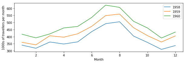
Let’s plot our previous air travel dataset… We’ll plot it as annual lines, so the x axis will be month number (running from 1 to 12) and the y axis will be 1000s of passengers. Different line colours will be used for every year. We’ll also add x and y axes labels, as well as a legend:
# You can probably just put this at the top of every notebook you write
# Adding it here for completeness
%matplotlib inline
import numpy as np
import matplotlib.pyplot as plt


# Load airtravel data
air_travel = np.loadtxt("data/airtravel.csv", skiprows=6, \
                        unpack=True, usecols=[1,2,3], delimiter=",")

mths = np.arange(1, 13)
plt.figure(figsize=(10,3))
plt.plot(mths, air_travel[0], '-', label="1958")
plt.plot(mths, air_travel[1], '-', label="1959")
plt.plot(mths, air_travel[2], '-', label="1960")
plt.xlabel("Month")
plt.ylabel("1000s of travellers per month")
plt.legend(loc="best")
<matplotlib.legend.Legend at 0x1169609b0>
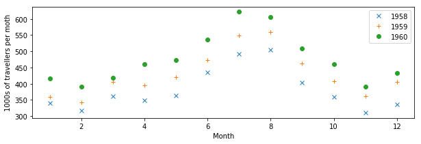
You may not want to use lines to join the data points, but symbols like dots, crosses, etc.
plt.figure(figsize=(10,3))
plt.plot(mths, air_travel[0], 'x', label="1958")
plt.plot(mths, air_travel[1], '+', label="1959")
plt.plot(mths, air_travel[2], 'o', label="1960")
plt.xlabel("Month")
plt.ylabel("1000s of travellers per moth")
plt.legend(loc="best")
<matplotlib.legend.Legend at 0x116a925f8>
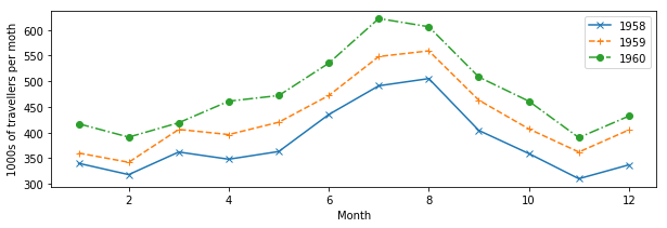
We can also use dots and lines. Moreover, we can change the type of line: from full lines to dashed to dash-dot…
plt.figure(figsize=(10,3))
plt.plot(mths, air_travel[0], 'x-', label="1958")
plt.plot(mths, air_travel[1], '+--', label="1959")
plt.plot(mths, air_travel[2], 'o-.', label="1960")
plt.xlabel("Month")
plt.ylabel("1000s of travellers per moth")
plt.legend(loc="best")
<matplotlib.legend.Legend at 0x11691b7b8>
Exercise 2.5.2
The file `NOAA.csv <data/NOAA.csv>`__ contains data from
NOAA on the number of
storms and hurricanes in the Atlantic basin from 1851 to 2015. The data
columns are described in the first row of the file. The year is in
column 1 and the number of hurricanes in column 3.
For those interested, the data is pulled from the website with getNOAA.py.
- load the year and hurricane data from the file
`NOAA.csv<data/NOAA.csv>`__ into a numpy array - produce a plot showing the number of hurricanes as a function of year, with the data plotted in a blue line
- put a dashed red line on the graph showing the mean number of hurricanes
- plot circle symbols for all years where the number of hurricanes is greater than the mean + 1.96 standard deviations.
Hint: the options on np.loadtxt you probably want to use are:
skiprows, delimiter, usecol and unpack. You will need to
select the data that meet the required conditions, combining the
conditions with np.logical_and().
# do exercise here
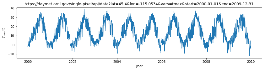
2.5.2 requests
We can use np.loadtxt or similar functions to load tabular data that
we have stored locally in e.g. csv format.
Sometimes we will need pull a data file from a URL. We have used this idea previously to ‘scrape’ data from a web page, but often the task is more straightforward, and we effectively need only to ‘download’ the data in the file.
We will use the requests package to do this and pull the data as a
string. We then use StringIO to allow np.loadtxt to think the
string comes from a data file.
import requests
from io import StringIO

# Define the URL with the parameters of interest
url = "https://daymet.ornl.gov/single-pixel/api/" + \
        "data?lat=45.4&lon=-115.0534&vars=tmax&start=2000-01-01&end=2009-12-31"

data = requests.get(url).text

# You can check the text file to see its contents, but we now
# (i) it's separated by commas
# (ii) the first 8 lines are metadata that we're not interested in.
temperature = np.loadtxt(StringIO(data), skiprows=8, delimiter=",", unpack=True)

# We expect to get 10 years of data here, so 3650 daily records
# the data are given for 365 days per year ...
print(temperature.shape)
(3, 3650)
If we want to store the data file, we can do so by opening a file:
# We open the output file, `daymet.csv`
with open("data/daymet_tmax.csv", 'w') as fp:
    # make the HTTPS connection and pull text
    # then write to file
    r = fp.write(data)

# You can check the text file to see its contents, but we now
# (i) it's separated by commas
# (ii) the first 9 lines are metadata that we're not interested in.
temperature = np.loadtxt("data/daymet_tmax.csv", skiprows=8, delimiter=",", unpack=True)

# We expect to get ~10 years of data here, so 3650 daily records
print(temperature.shape)
(3, 3650)
The data columns are: Year, day of year (1 to 365) and Tmax
(\(C\)).
How can we plot such data? the technical issue we face is needing to use the first two columns of data (day of year and year) to describe the x-axis location.
print('Year ',temperature[0])
print('DOY  ',temperature[1])
print('T_max',temperature[2])
Year  [2000. 2000. 2000. ... 2009. 2009. 2009.]
DOY   [  1.   2.   3. ... 363. 364. 365.]
T_max [-1.5 -2.5 -1.5 ... -1.5 -3.  -2. ]
A simple way of doing this, that would suffice here, would be to convert day of year to year fraction, then we could write:
year,doy,tmax = temperature
dates = year + (doy-1)/365.
A more elegant way might be to use
`datetime <https://docs.python.org/3/library/datetime.html>`__. This
contains a set of methods that allow you to manipulate date formats.
matplotlib understands the format used, and so it is generally
appropriate to use datetime for date information when plotting.
year,doy,tmax = temperature
dates = [datetime.datetime(int(y), 1, 1) + \
     datetime.timedelta(d - 1) for y,d in zip(year,doy)]
import datetime

year,doy,tmax = temperature
dates = year + (doy-1)/365.
# using the simple way here

plt.figure(figsize=(14,3))
plt.plot(dates,tmax)
plt.title(url)
plt.ylabel('$T_{max} / C$')
plt.xlabel('year')
Text(0.5, 0, 'year')
Exercise E2.5.3
- use the datetime approach to plot the dataset
- print out the value of
datesfor the first 10 entries to see what the format looks like
# do exercise here
Although we have used this as a one-dimensional dataset (temperature as
a function of time) we could also think of it as two-dimensional
(temperature as a function of (year,doy)). Recall that the shape of
the temperature dataset was (3,3650). We could put the
temperature column into a gridded dataset of shape (10,365) which
would then emphasise the 2-D nature.
We can do this with the numpy method reshape().
year = temperature[0].reshape(10,365)
doy  = temperature[1].reshape(10,365)
tmax = temperature[2].reshape(10,365)

plt.figure(figsize=(14,3))
plt.plot(doy,tmax,'x')
plt.title(url)
plt.ylabel('$T_{max} / C$')
plt.xlabel('day of year')
plt.xlim([1,366])
(1, 366)
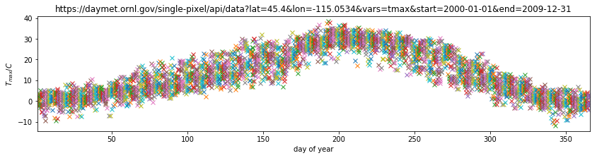
Plotting this, we can visualise the year-on-year variations in temperature for any particular day.
Exercise E2.5.3
- using the reshaped datasets above, calculate and plot the mean value
of
tmaxas a function of day of year - calculate standard deviation of
tmaxas a function of day of year, and plot dashed lines at mean +/- 1.96 standard deviations - in another plot, show the mean, +/- 1.96 standard deviations of
tmaxas a function of year (i.e. the annual average and standard deviation)
Hint: use axis=0 when calculating the mean/std over doy of
tmax and axis=1 for processing over year.
2.5.4 Homework
Exercise E2.5.4
Select 4 locations in different regions of North America (e.g. Anchorage, Albuquerque, Seattle, Chicago). Request data on maximum temperature, precipitation and incident solar radiation for the years between 1981 to 2010, and plot in 3 different figures:
- Figure 1: The mean daily temperature and the variation (a shaded area around the mean going from mean value minus 1.96 times the standard deviation to mean value plus 1.96 times the standard deviation). Use a subplot or panel for each site
- Figure 2: The mean daily precipitation and the variation (a shaded area around the mean going from mean value minus 1.96 times the standard deviation to mean value plus 1.96 times the standard deviation). Use a subplot or panel for each site
- Figure 3: The mean daily incident solar radiation and the variation (a shaded area around the mean going from mean value minus 1.96 times the standard deviation to mean value plus 1.96 times the standard deviation). Use a subplot or panel for each site
In each plot, the mean value should be a full line, and the variation should be an envelope, visually similar to the plot shown below (clearly not identical!!!!)
la niña plot
Label each plot with a title, units and so on. Some useful functions to consider
`plt.subplots<https://matplotlib.org/api/_as_gen/matplotlib.pyplot.subplots.html>`__ Allows you to split a figure into several panels or subplots. In particular, pay attention to thesharexandshareyoptions that allow you to have the same scales for all plots so they can be directly compared.`plt.fill_between<https://matplotlib.org/api/_as_gen/matplotlib.pyplot.fill_between.html>`__ Allows you to fill the space between two curves. You may want to give the optioncolor=0.8for a nice grey effect.
# do exercise here
2.5.5 Summary
In this section, we have learned about reading data from csv files from the local disc or that we have pulled from the web (given a URL). We have gone into a little more detail and sophistication on plotting graphs, and you now should be able to produce sensible plots of datasets or summaries of datasets (e.g. mean standard deviation).